
Brand Transformation
Manama Club
Respecting the past. Building what comes next.
A modern identity designed to move the club forward without losing the history and emotion behind it.
- Brand Strategy
- Creative Direction
- Visual Identity
- Sports
Brand story
A club identity built to carry its history forward.
The system protects what supporters recognise, then gives Manama Club a clearer, more confident way to show up.
Brand strategy
Heritage, ready for the next chapter.
Three principles kept every decision grounded in the club rather than in short-lived visual trends.
Recognisable
Keep the signals that already feel unmistakably Manama.
Competitive
Bring clarity and confidence to every match-day moment.
Collective
Build a system players and supporters can both own.
Sketch and exploration
Finding the mark before refining it.
Sketches test how heritage, motion and strength can meet in one unmistakable silhouette.
Crest and marks
One crest. A complete mark family.
Primary, compact and single-colour forms keep the identity clear from a social avatar to a stadium sign.
Colour system
Colour with match-day presence.
A disciplined palette keeps the club recognisable across kit, print, screen and the stadium.
Typography
A voice for scores, stories and statements.
The hierarchy moves from direct match information to expressive campaign headlines without losing clarity.
Graphic language
Calm when it needs to inform. Loud when it needs to rally.
Grid, crop and supporting devices give the identity range while every composition still feels like one club.
Applications
The identity earns its place in use.
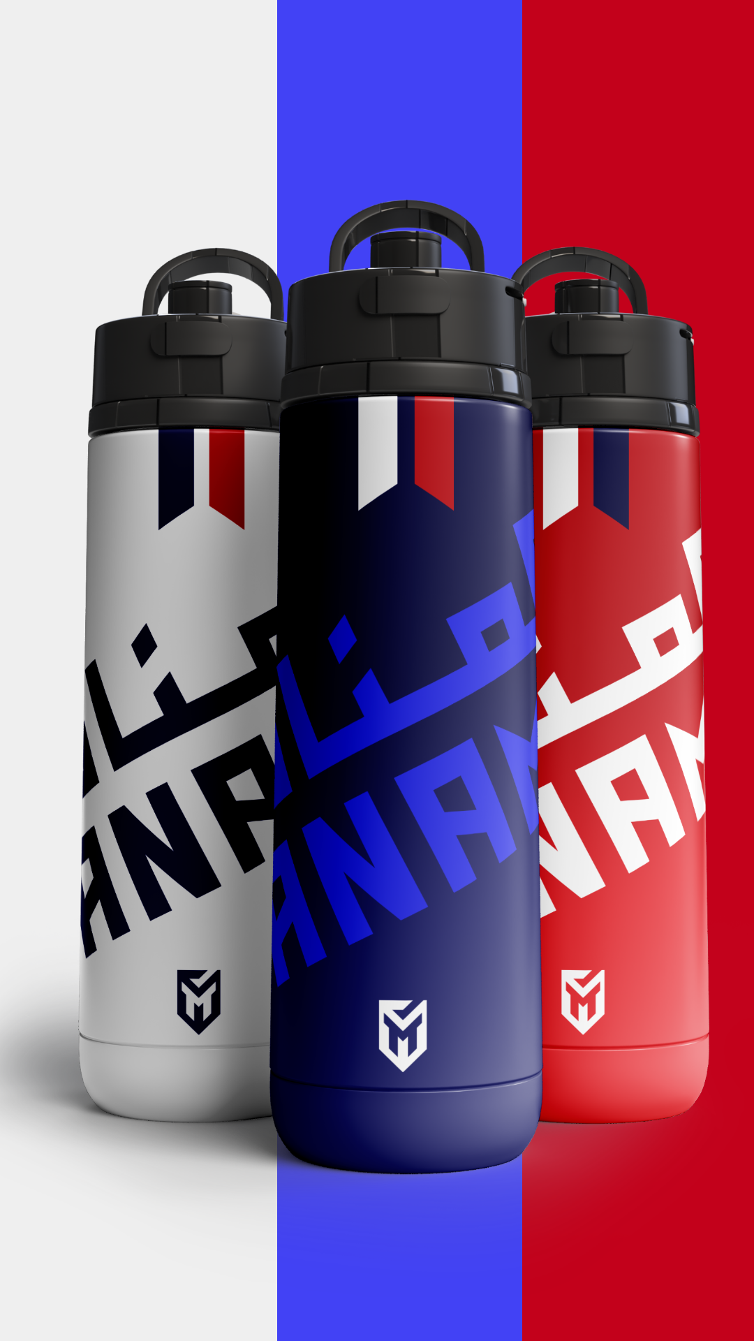
A swipeable set of match-day, merchandise, social and environment applications shows the system working at different levels of intensity.
Application 1 of 6
The measure
New enough to move forward. Familiar enough to belong.
That balance is what turns a redesign into a living club identity.